
The use of tactile paving is one subject to guaranteed to get engineers, urban designers and users into a debate on what is needed and how it should be laid out.
Well, the Government is currently consulting on some interim changes to the current guidance which dates back to 1998 and is apparently based on research carried out in the 1980s. This post is not about how tactile paving should be laid, but some observations on the proposals which I have separately sent off as a consultation response (you have until 13th November if you fancy responding).
You may disagree with me, but I will try and give some reasoning. I will also add that the proposals are limited and are not a rewrite of the whole document. I did cover a fair bit of detail on tactile paving some time ago which was inspired from a workshop I attended where the draft consultation (and other issues) were debated.
 The first thing to say is that the current guidance doesn't often fit into the real world, especially where tactile paving is installed on a corner, rather than being from a straight kerb line (which isn't a problem). The example on the left is aimed at people crossing the road to the right of the photo.
However, a visually impaired person walking ahead could mistake this layout for indicating that they should proceed ahead at a crossing point (which it's not). The problem is that people cannot align themselves with the crossing direction particularly easily.
The interim proposals are to ensure that where tactile paving is being provided on corners, that it be cut in to the same curve at the rear of the tactiles so a constant width strip is provided (typically 800mm or 1200mm).
You can see the idea in the consultation document, but a real-world example might be helpful, so here is a Google Streetview image of a site near Liverpool Street Station in the City of London;

You can see a constant curve of tactile paving 800mm deep. The square tactile paving units are cut in to suit as the little domes (or blisters) need to show the direction people should walk to meet the tactiles on the opposite side - note the stem to the left (right from a user point of view) which shows where the push-button for the crossing is located. In theory, this makes things much clearer for visually impaired users. Here is the comparison between the existing and proposed guidance (from the consultation);

The problem with the layout is that we now end up with two places to cut the slabs into and in my experience, it is hard enough to get people to do it right now, let alone with two sides to cut. If it is not done right, we end up with really small pieces of paving which are a horror to maintain as they always fail.
The other option being proposed is rather than cutting the rear strip in, whole slabs can be used, but stepped in - again from the consultation;

In essence, this is an approximation of the shape of the kerb on the corner and avoids having to cut slabs at the rear. From a user point of view, there is less likelihood of confusion as they will know that the staggered pattern runs parallel with the kerb. A stem can still be provided when required.
This option has been provided because of concerns raised about cuts creating small pieces of slab. It has taken me a while to be won round, but because we need to do more to help users (hence the idea of the interim guidance), but I am happy to support the second version. The first is too much fiddling about from a practicality and maintenance point of view. Urban design types will prefer the first because it looks neater, fine, invest the time and money is designing the layout of the slabs and cutting in correct rather than leaving it to the poor contractor. Not every site uses high quality paving and so does it really need to be made more complicated? In fact, allow both options if we must. Where the kerb is straight, the guidance holds as it will just be two or three rows of slabs.
Next, we have an important suggestion and that is the issue of colour. Currently, red is reserved for controlled crossings (signals and zebra) which urban designers hate (because it is ugly), and any other colour can be used at uncontrolled crossings, so long it is a contrast to the surrounding paving colour. Most people specify buff for uncontrolled crossings as it works in most places. The proposal is to do away with the red requirement for controlled crossings and simply go for a colour contrast of 50% - the suggested text is;
The tactile surface used to indicate the presence of a controlled crossing should provide a contrast ratio of at least 50% to the surrounding paving in both wet and dry daylight conditions and when illuminated by the adjacent street lighting at night.
I am not yet sure how one measures this (we'll get there, I'm sure), but this means that for those with low colour vision, the contrast will be far clearer. Some mock ups are given which show how poorly red performs;

Clearly, dark tactiles on a light paving or light tactiles on a dark background works a treat. This also holds for uncontrolled crossings as well. Again, stems are used where required at controlled crossings. The current guidance allows for a departure from red if local conditions are appropriate (such as in conservation areas), but this has been pushed too much to a point where there is little or no contrast such as this example from Silk Street in the City of London (again from Google);

The paving and tactiles are all York stone and there is very little contrast for visually impaired people. The urban designers might get upset at dark grey or black tactiles here, but they would look better than red and do a proper job for users. Yes, I fully support this, but there needs to be some help on measuring contrast and selecting materials.
The next one will be controversial. It starts by stating;
"Introduce a universal requirement for the boundary between carriageway and footway to be demarcated with tactile paving wherever they are at the same level"
 OK, at first glance this makes some sense and I refer you to Exhibition Road in Kensington, London. I don't like the scheme, but that doesn't matter for now as the point is that a line of corduroy tactiles were provided to show a "footway" zone after a campaign and legal threat by Guide Dogs.
Of course, the main part of the road remains a traffic sewer and the need to show a footway makes a mockery of the so called "shared space" scheme (it is actually a single surface shared space, but that's another blog). So, visually impaired users want and need some sort of demarcation in this type of situation as an entirely separate issue from whether or not a particular scheme is a good idea.
It does seem fair enough, but then we get this as the suggested guidance;
Wherever there is no level change between carriageway and footway, or a level change of less than 60mm, the boundary between footway and carriageway should be delineated with a tactile surface of at least 800mm in depth. This rule should apply to any continuous barrier-free surface occupied by pedestrians and vehicles be that a flat top road hump, a raised side road or junction, or an extended level surface area.
Before I comment, let's look at the current guidance for a flat-top road hump across a whole junction;


I am not sure what pattern of tactile paving is being proposed where here. Utterly confusing for the designer, so goodness knows what nonsense would get built. But it is worse. The spirit of equality legislation is new schemes should cater for the needs of users with protected characteristics (e.g. disabled people) and rightly this extends to the use of appropriate tactile information where required. This up to 60mm upstand (which I predict will be called the "60mm rule" if it goes forward) will mean that designers either go flush or make sure they are above 60mm (and perhaps that might be appropriate long term).
However, it is also the spirit of equality law that reasonable adjustments be made by highway authorities where infrastructure is substantially refurbished. When a footway is being resurfaced or reconstructed, good highway authorities already provide decent dropped kerbs with appropriate tactile paving as part of the maintenance operation and that is good practice. But, what if this work is taking place where the existing kerb (which may have been there for 100 years) only has a 50mm upstand - will a reasonable adjustment end up meaning an 800mm strip of tactile paving has to be provided too? (right where some drivers bounce onto the footway edge) Sorry, this has not been thought out properly.
 Here is (I promise you) a random street in Forest Gate, East London (Google again). There are lots of streets like this with wide granite kerbs, laid with a very small kerb face. I have not measured this, but it is probably around 60mm, possibly a touch higher, but it demonstrates my worry about the pitfalls. What about vehicle crossings which have a kerb face of about 25mm to 40mm - are we to put a strip of tactile paving along the edge of every new one? I will leave you to think about that one!
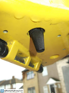 Next we have the situation (which is not paving!) where most authorities only place a rotating tactile cone on the right hand side of signalised crossings which have push buttons on both sides. For visually impaired people, this is a pain because if you reach the left hand box first, you still need to get to the right hand box for the cone. The suggestion is cones on both sides. It's a fair idea, although with complicated layouts, there is a risk that people may feel a cone on the left which is meant to be for a different crossing, so designer care is needed (as should be the case). The photo to the right is an example of a cone.
 Finally, we have a neat suggestion for a tactile arrow on top of push button boxes (as borrowed from Israel!) to show the direction of the crossing. I assume that this will be adjustable on site or a stick-on plate, as the position of the box (as in angle to the road) varies with site conditions. So apart from the installer getting it right, this seems like a good idea and would cost very little to roll out with new installations/ replacements.
So, there you have it. A bit of a mixed bag, but I do think the flush to 60mm issue needs more discussion and consideration as it is going to create a bit of a mess in my view. As I have said, these views will be sent on to the consultation, but please, have your say.
You may disagree with me, but I will try and give some reasoning. I will also add that the proposals are limited and are not a rewrite of the whole document. I did cover a fair bit of detail on tactile paving some time ago which was inspired from a workshop I attended where the draft consultation (and other issues) were debated.

However, a visually impaired person walking ahead could mistake this layout for indicating that they should proceed ahead at a crossing point (which it's not). The problem is that people cannot align themselves with the crossing direction particularly easily.
The interim proposals are to ensure that where tactile paving is being provided on corners, that it be cut in to the same curve at the rear of the tactiles so a constant width strip is provided (typically 800mm or 1200mm).
You can see the idea in the consultation document, but a real-world example might be helpful, so here is a Google Streetview image of a site near Liverpool Street Station in the City of London;

You can see a constant curve of tactile paving 800mm deep. The square tactile paving units are cut in to suit as the little domes (or blisters) need to show the direction people should walk to meet the tactiles on the opposite side - note the stem to the left (right from a user point of view) which shows where the push-button for the crossing is located. In theory, this makes things much clearer for visually impaired users. Here is the comparison between the existing and proposed guidance (from the consultation);

The problem with the layout is that we now end up with two places to cut the slabs into and in my experience, it is hard enough to get people to do it right now, let alone with two sides to cut. If it is not done right, we end up with really small pieces of paving which are a horror to maintain as they always fail.
The other option being proposed is rather than cutting the rear strip in, whole slabs can be used, but stepped in - again from the consultation;

In essence, this is an approximation of the shape of the kerb on the corner and avoids having to cut slabs at the rear. From a user point of view, there is less likelihood of confusion as they will know that the staggered pattern runs parallel with the kerb. A stem can still be provided when required.
This option has been provided because of concerns raised about cuts creating small pieces of slab. It has taken me a while to be won round, but because we need to do more to help users (hence the idea of the interim guidance), but I am happy to support the second version. The first is too much fiddling about from a practicality and maintenance point of view. Urban design types will prefer the first because it looks neater, fine, invest the time and money is designing the layout of the slabs and cutting in correct rather than leaving it to the poor contractor. Not every site uses high quality paving and so does it really need to be made more complicated? In fact, allow both options if we must. Where the kerb is straight, the guidance holds as it will just be two or three rows of slabs.
Next, we have an important suggestion and that is the issue of colour. Currently, red is reserved for controlled crossings (signals and zebra) which urban designers hate (because it is ugly), and any other colour can be used at uncontrolled crossings, so long it is a contrast to the surrounding paving colour. Most people specify buff for uncontrolled crossings as it works in most places. The proposal is to do away with the red requirement for controlled crossings and simply go for a colour contrast of 50% - the suggested text is;
The tactile surface used to indicate the presence of a controlled crossing should provide a contrast ratio of at least 50% to the surrounding paving in both wet and dry daylight conditions and when illuminated by the adjacent street lighting at night.
I am not yet sure how one measures this (we'll get there, I'm sure), but this means that for those with low colour vision, the contrast will be far clearer. Some mock ups are given which show how poorly red performs;

Clearly, dark tactiles on a light paving or light tactiles on a dark background works a treat. This also holds for uncontrolled crossings as well. Again, stems are used where required at controlled crossings. The current guidance allows for a departure from red if local conditions are appropriate (such as in conservation areas), but this has been pushed too much to a point where there is little or no contrast such as this example from Silk Street in the City of London (again from Google);

The paving and tactiles are all York stone and there is very little contrast for visually impaired people. The urban designers might get upset at dark grey or black tactiles here, but they would look better than red and do a proper job for users. Yes, I fully support this, but there needs to be some help on measuring contrast and selecting materials.
The next one will be controversial. It starts by stating;
"Introduce a universal requirement for the boundary between carriageway and footway to be demarcated with tactile paving wherever they are at the same level"

Of course, the main part of the road remains a traffic sewer and the need to show a footway makes a mockery of the so called "shared space" scheme (it is actually a single surface shared space, but that's another blog). So, visually impaired users want and need some sort of demarcation in this type of situation as an entirely separate issue from whether or not a particular scheme is a good idea.
It does seem fair enough, but then we get this as the suggested guidance;
Wherever there is no level change between carriageway and footway, or a level change of less than 60mm, the boundary between footway and carriageway should be delineated with a tactile surface of at least 800mm in depth. This rule should apply to any continuous barrier-free surface occupied by pedestrians and vehicles be that a flat top road hump, a raised side road or junction, or an extended level surface area.
Before I comment, let's look at the current guidance for a flat-top road hump across a whole junction;

You will note the guardrail provided in the location where one would expect a small kerb upstand (if done right, the tactile crossing points have a flush kerb which would raise slightly at corners as this type of hump would be 75mm to 100mm high normally, and kerbs are nominally 125mm high). I don't recall ever seeing this in real life!
So this proposed guidance gives the message to a visually impaired person that beyond this 800mm strip of tactile surface there is either a flush surface or a step of up to 60mm. The proposed interim guidance doesn't specify which tactile pattern is appropriate and so I have to assume corduroy, which is also sometimes used to show the start of a shared cycle track or at the top/ bottom of stairs. Of course, if there is a crossing point, it will be blister paving and at corners - your guess is as good as mine. Yes, this will make things quite complicated. The new diagram is as below;

However, it is also the spirit of equality law that reasonable adjustments be made by highway authorities where infrastructure is substantially refurbished. When a footway is being resurfaced or reconstructed, good highway authorities already provide decent dropped kerbs with appropriate tactile paving as part of the maintenance operation and that is good practice. But, what if this work is taking place where the existing kerb (which may have been there for 100 years) only has a 50mm upstand - will a reasonable adjustment end up meaning an 800mm strip of tactile paving has to be provided too? (right where some drivers bounce onto the footway edge) Sorry, this has not been thought out properly.


So, there you have it. A bit of a mixed bag, but I do think the flush to 60mm issue needs more discussion and consideration as it is going to create a bit of a mess in my view. As I have said, these views will be sent on to the consultation, but please, have your say.
As soon as I saw they were suggesting the two rows of tactiles with the rear edge parallel to the front I wondered who on earth could have come up with that idea. On the average crossing on a radius the tactile paviours will be left in a godawful state if current examples of block laying are anything to go by.
ReplyDeleteAs for the tactiles between 'footway' and 'carriageway' I think this should be something solely for shared space - which, as you suggest, usually isn't (shared) - and as an alternative to kerbs where there is a complete lack of upstand. I do understand where the 60mm comes from - some Guide Dogs/Ramboll Nyvig research I believe - but placing paviours wherever the upstand is below this figure opens a can of worms. BTW, I was under the impression the paving they wanted for this delineation was the guidance path stuff?
Andy R.
I think this is a rush job to be seen to be doing something and it hasn't been thought through. Why not wait and do a proper job?
Delete