Well, it has been a few weeks of rambling, so I am back with the technical this week with little bit of insider knowledge which you might find useful.
The Department for Transport collects traffic flow data on every junction to junction link on the A-road and motorway network in the country. A link is a street between two junctions with other A-roads (often called "nodes" in the business). The data is published and the home page is linked here. In order to find you place of interest, they also have an interactive map which can be found here. The map has a menu which allows you to select the local authority area you are interested in.
 |
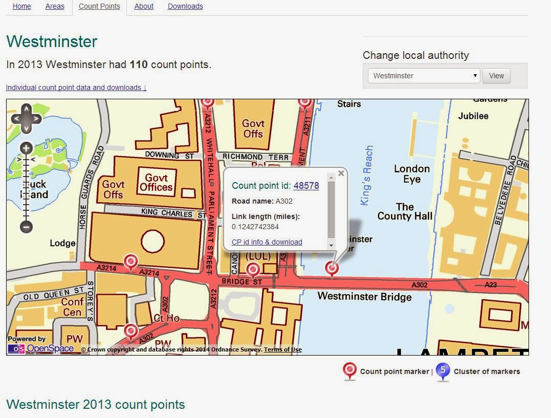
| A screenshot for Westminster Bridge. |
You can zoom in on the area of interest (or you can manually select the count point), not forgetting you need to change authority area if you move the map around.
Let's look at Westminster Bridge (A302) in London as an example. Click on the icon which points to the link of interest and a speech bubble appears with some information. Then click on the "count point id" and you are taken to a table of links - you need to look for the count point ID here. If you then click "download" in the right of the screen, the data for that count point will download as a spreadsheet .CSV file.
The surveys are snapshots; simply annual traffic counts which show what happened in the the face of prevailing conditions, policies in force etc. I am not suggesting for a minute that this data should be used as a forecasting tool, but it can show trends over time. If you download the .CSV file it will give you the year on the far left hand side (back to 2000 in many cases) and various columns including location and technical stuff, plus traffic flow broken down by type. Pedal cycles, motorcycles, cars/taxis, buses/ coaches, light good vehicles and the full range of HGVs; the last column being total traffic.
There is a health warning with this data. It is based on an "average" day's traffic - traffic over a full 24 hours, so you cannot pick out the peaks (the Annual Average Daily Flow - AADF) and so for any given day or time things could be busier or quieter. The data is also for both directions of traffic added together (unless a one-way road of course). The data does not drill down into more local roads and so is intended for use at a higher level. Nonetheless, it is interesting and opens opportunities to challenge assumptions which are often made.
Looking at Westminster Bridge, I have considered bike use as a percentage of all motor traffic (which is easy to play with having a spreadsheet). I have simply added bike and traffic flows and then calculated the percentage of bikes.
From this snapshot, the trend has been for all traffic to decline to a point where in 2013, it was less than half than it was in 2000. Over the same period bike flows peaked in 2010/11 which was also the highest percentage of total flow. By 2013, bike flow as a percentage of all traffic had dropped and, with traffic flows dropping as well, it is not surprising that bike use dropped off in the way it did.
I have no answers as to why things have changed as they have - that is one for the academics and those that know the area. My guess is that the motorised traffic falls is a long term trend and the cycling figures are rather volatile - perhaps a better parallel route opened for bikes in 2012, perhaps the high was just a blip - answers on a postcard (or the comments) please!
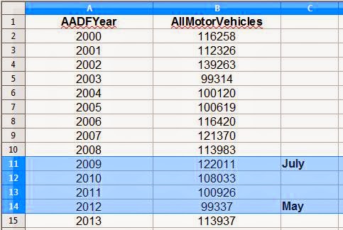
Here is another set of data, this time for the Dartford River Crossing (A282). Don't be too shocked about bike use - they are stuck on 4x4s and carried over and getting to the crossing points involves using some very unpleasant roads! I have highlighted the period where junctions 27 to 30 were being widened and so it is possible that flows dropped because of the lower speed limit in force at the time, although 2013 saw another slight dip.
For comparison, here is the data for the link between junctions 29 and 30. Again, a bit of a dip during the road works, although despite now having 4 lanes in direction (rather than 3), traffic flows were a little lower than in 2000 - did we need to spend all of that money?
Well, look at the data in 5 years time to see if more traffic is using this section of motorway, but there doesn't seem to have been the traffic growth which the Government is so worried about tackling on this stretch of motorway. Where was the justification in widening? I leave that comment hanging as I know full well that the area is far busier during the day time!
OK, let's look at what has been happening at one more place, the A118 Stratford High Street. This link is where the extension to Cycle Superhighway 2 was completed towards the end of 2013 please correct me if I am wrong).
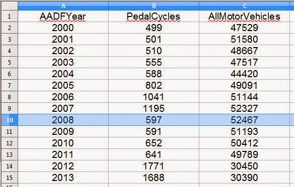
So, "peak traffic" was in 2008 and by 2011, traffic was less than it was ten years before. I don't know if any tweaks were made because of the Olympics in 2012 (it should still be representative), but the drop was dramatic. In 2013 traffic stayed at this new lower level. Again, the information over the next few years will be interesting.
Cycling was relatively popular leading up to 2007, but dropped of in 2008 (did politics shift or something?). It has been on the increase since, but only time will tell if 2012 was the peak or if CS2X is making a difference. One generalisation I might make is that with general traffic dropping, there was "slack" to reallocate the road space to cycling. What might have been seen as a bold scheme in building CS2X, could well have had some science behind it (I bet it did) as all of the howls of chaos before it was built don't seem to have materialised (again, correct me if I am wrong).
I have only considered a few locations, but the point is that the data exists and we pay for it to be collected. So, why not realise your investment and have a play with the figures yourself? I have most recently used the data to show the potential impacts of a relatively modest development where vehicles accessing the development is a tiny fraction of overall traffic in the area, but HGV movements increase by a fifth which is locally significant. Do beware. The numbers just benignly sit there doing nothing, it is how they are interpreted which counts. As I have said before with statistics, they can be used for good or evil!
Update Thursday 2nd October 2014
Those in London might like to play with Alex Ingram's interactive map based on the DfT information - Thanks GM Cycling Campaign!
Update Thursday 2nd October 2014
Those in London might like to play with Alex Ingram's interactive map based on the DfT information - Thanks GM Cycling Campaign!


I saw these traffic stats referenced on another blog a while back so looked at the figures for some roads near where I live in West London. Similar to your findings, the motor vehicle count had dropped on all of the roads since 2000.
ReplyDeleteLast year I had an email exchange with a planner in a west London borough asking why they couldn't put in proper cycle lanes on a street where some work was being done. I got the standard response that they would "disrupt traffic flow". I pointed out the DfT stats showing how much the traffic had dropped over the last 12 years and asked what level the traffic would would need to be for a cycle lane to have no impact on traffic flow. Funnily enough, I didn't get a response.
Perhaps "we" (my area of work) have provided for traffic for so long, it is impossible to consider other possibilities. Things are changing slowly as more senior people retire and others take over - a massive oil tanker to steer though!
DeleteWhen working for an LA in London the received wisdom was that the DfT figures were pretty unreliable: the basis for calculating AADF is not robust, as I think you say.
ReplyDeleteThe thing is that in London, if TfL had got its act together, good figures for cycling (to change the subject away from all modes) could have been generated, but only really exist so far in a form which TfL can present on the TLRN (TfL roads).
The reason is that automatic counters (of any kind) find it difficult to pick out cyclists unless they are in locations ((like a segregated or off-road track) where motors don't interfere with the signal.
Basically manual counts (nowadays that means using video) should be used - but that costs. Since TfL has about a £5 billion net spend p.a., this kind of counting should be done in at least parts of London.
I did try to pressure TfL to do this, but I don't know how far they mean to take this
Yes, counts can be inaccurate, but DfT do use manual counts as well. One thing that TfL is rolling our is SCOOT which can record traffic conditions through signalised junctions, including cyclists (if the right detection is used). I do think that bikes and indeed people walking are never properly included (if at all) in the numbers or even conversation.
DeleteYour report highlights the fluctuating levels of cycling in two locations, Westminster Bridge and Stratford High Street. I confess, I cannot readily explain what has been happening on Westminster Bridge, but I believe the spike in cycling numbers on Stratford High Street about eight or nine years ago can be explained by the 7/7 bombings.
ReplyDeleteInteresting point - I think there is a serious piece of academic research to be done looking at the impact of major events on how people travel, possibly then looking to how build in more resilience to transport networks.
DeleteIt's certainly interesting, but some of the numbers near me are absolutely bizarre.
ReplyDeleteOn one count the number of pedal cycles averaged 16.1 from 2000-2008, but 96.6 from 2009-2013. However, in a count less than a mile away, the 00-08 average was 125.7, the 09-13 was 58.2. So, a six-fold increase versus a 50% decrease!
Small numbers in any analysis can show wild fluctuations and should be viewed with caution - the long term trend is much more useful, but still an issue if numbers stay small.
DeleteRanty, I'd surely like to see how SCOOT detection can distinguish between bicycles and motors. As I say, getting any kind of non-manual counting for bicycles is very difficult.
ReplyDeleteI repeat the point about DfT figures being unreliable. As russellelly says, you sometimes some really bizarre figures - and they are not just wild fluctuations from very small numbers.
Covered cycle SCOOT a bit here:
Deletehttp://www.therantyhighwayman.blogspot.co.uk/2014/03/traffic-signal-pie-second-slice-scoot.html
but, yes, results are highly variable unless it is almost guaranteed that bikes pass close enough to the detector (OK, they would on a track).