There was a tweet doing the rounds the other day about how how ugly someone thought that a secure cycle parking shelter was with a suggestion that a design competition be held to come up with something better.
The person who posted the tweet compared the shelter with a farm pig shelter and thought that the place which developed the Routemaster bus, red telephone kiosks and black cabs could do better with a design competition as an idea.
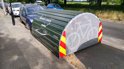
The actual shelter being criticised was the Bikehangar like the one above by Cyclehoop which essentially provides six secure cycle parking places in the same space as half a car parking space. I will declare a modest interest here as I have done a little bit of work for Cyclehoop, although not on this product.
In general terms, this piece of kit does a good job with an efficient use of materials. From the conversations arising from the tweet, the only real criticism people had was that leaves and rubbish can get blown into the unit from below. The need for the unit is derived from places where people's homes cannot provide cycle parking internally and having cycles as easy to access as possible means they are more likely to be used.
There are other manufacturers providing competing systems with the common features of a large lid which can be opened up to get maximum access to the cycles for ease of locking and unlocking within, and a shell which has dimensions to maximise usable space inside, while not wasting space and therefore materials.
In terms of size, that is generated by the length of cycles to get the shelter width and the length of a unit will be limited by the size and therefore weight of the roof (even with gas struts to help with opening/ closing). They also need to be maintainable with the ability to keep them clean and to remove graffiti. You could of course use different types of cladding or maybe build the ends in brick, but that comes with costs, weight and maintenance issues. Once you move into bespoke, you pay for it.
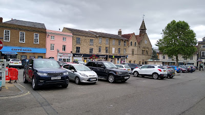
Cornhill, Bury St Edmunds. A car park instead of a public square.
I have been seeing hangars pop up over London for the past several years and the common denominator has been that they are invariably placed within or at the ends of a run of car parking spaces and that is the elephant in the room. Parked cars take up significant amounts of public space, both physically and visually. It's not just the vehicles, it's the extent of asphalt, road markings and traffic signs which are needed to service them. Streets and squares (above) are subsumed into feeding our habit and that gets lost in the discussion.
I'm not against having a design competition for secure on-street cycle parking, although presumably a manufacturer would have to be involved unless the outcome is open-source. Design competitions are good for inspiration and for profile-raising to be sure, but I do struggle to see what design innovation is available, given various manufacturers have been delivering these for years now.
I have always been a bit of a function before form person. This view has been forged in the furnace of countless arguments with people who fail to understand that there are users and maintainers to consider. I therefore have some long-held biases.
However, I'm not convinced that the rotten accessibility of the old Routemaster helps its design classic status. Red telephone boxes are a nightmare to clean and maintain and black cabs are an expensive and space-hungry way to deliver transport in a city (although I actually like the shape of the hybrid electric version - above).
Something being a design classic or a design icon doesn't necessarily make it practical or useful, but personally, I think the Cyclehoop unit is a design classic which ably responds to the brief in a pragmatic and efficient way. By all means, let's have these conversations about the items placed within our streets, but let's not have these discussions in isolation.


No comments:
Post a Comment